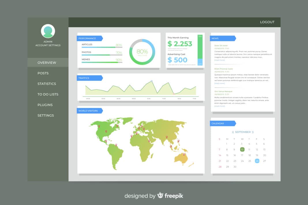
In today’s data-driven world, data visualization is no longer a luxury—it’s a necessity. Businesses across industries rely on visual insights to make faster, smarter, and more strategic decisions. However, traditional charts and graphs often fall short when it comes to understanding geospatial trends—where things happen and why location matters.
That’s where Power BI Azure Maps comes in. This powerful integration combines Microsoft’s industry-leading business intelligence visualization tool (Power BI) with Azure Maps, a cloud-based mapping platform. Together, they enable users to create dynamic, location-based dashboards that go far beyond basic maps, unlocking deeper insights through advanced data visualization.
What Is Power BI Azure Maps?
Azure Maps is Microsoft’s enterprise-grade geospatial service, providing mapping, routing, and location-based analytics. When integrated into Power BI, it becomes a versatile tool for geospatial analytics—allowing users to visualize complex data patterns directly on a map.
With Power BI Azure Maps, users can:
- Plot data points geographically with symbol layers
- Display density and concentration using heat maps
- Overlay reference layers (such as regional boundaries) for context
- Visualize movement, clusters, and demographic insights at a glance
Unlike static visuals, Power BI mapping tools powered by Azure Maps deliver interactive and scalable visualizations that reveal hidden location-based insights.
Setting Up Azure Maps in Power BI
Before you begin, ensure you have:
- The latest version of Power BI Desktop
- A valid Azure Maps account or key (if required for premium features)
- Location data (latitude/longitude or region names) in your dataset
Step-by-step setup guide:
- Open Power BI Desktop and load your dataset.
- In the Visualizations pane, select the Azure Maps visual.
- Drag your geolocation fields (such as city, country, or coordinates) into the corresponding data fields.
- Add numeric or categorical data (like sales volume, customer count, or performance score) to visualize metrics geographically.
- Adjust map settings such as zoom, theme, and view type (road or satellite).
Your Azure Maps visual is now ready to provide real-time location insights within Power BI.
Advanced Visualization Techniques
To fully leverage Power BI Azure Maps, explore its advanced visualization techniques that transform raw data into actionable intelligence.
1. Using Layers for Rich Insights
Azure Maps supports multiple layers, allowing you to combine data types for better context:
- Symbol Layer: Displays icons or shapes to represent data points.
- Heat Map Layer: Highlights areas of high density or intensity.
- Reference Layer: Adds contextual shapes, like country borders or sales territories.
2. Dynamic Filtering and Drill-Throughs
Add slicers or filters to dynamically explore your data by region, category, or time. Use drill-throughs to transition from a global overview to a detailed analysis at the city or branch level.
3. Real-Time Data Mapping
Integrate Azure Maps with live data streams (such as IoT sensors or logistics data) to create real-time dashboards. For example:
- Track fleet vehicles or shipments on a live map.
- Monitor energy usage across multiple facilities.
- Analyze real-time sales or service activity across regions.
4. Practical Use Cases
- Sales Performance by Region: Compare Product Demand Across Territories.
- Logistics Tracking: Visualize supply chain routes and delivery efficiency.
- Demographic Analysis: Understand customer distribution and market potential.
Customization and Interactivity
Power BI Azure Maps provides a wide range of customization options to make your dashboards both insightful and engaging:
- Color Gradients: Use gradient scales to highlight performance levels or intensity.
- Transparency and Layer Order: Adjust visual depth to make overlapping layers clear.
- Zoom Levels and Boundaries: Focus on a specific region or enable users to zoom freely.
- Tooltips and Pop-Ups: Add contextual details that appear when hovering over data points.
- Interactive Filters: Combine map visuals with slicers, timelines, and charts for a unified storytelling experience.
The result is a dynamic and user-friendly map visualization that encourages data exploration.
Best Practices
To get the most out of Azure Maps in Power BI, follow these best practices:
- Optimize Large Datasets: Aggregate or filter your data to improve map rendering speed.
- Ensure Data Accuracy: Validate geolocation fields to prevent misplaced data points.
- Maintain Data Privacy: Be cautious when visualizing sensitive or personal location data.
- Use Consistent Themes: Align map styles with your organization’s BI dashboard standards.
- Test Across Devices: Ensure that visuals are responsive and clear on both mobile and desktop devices.
Conclusion
By integrating Azure Maps with Power BI, organizations can transform static data into interactive geospatial stories. From understanding sales distribution to tracking logistics and analyzing customer demographics, this integration empowers businesses with advanced data visualization capabilities that drive smarter, more informed decisions.


